Saturday, October 24, 2009

Stabmixer. Handblender.

Sweet and ever so patient hopefuls,

Today would make a great day for yet another post,
and today's post will be more or less in harmony with last post.
Isn't that wonderful? Coherence is an admirable goal right?

This post is dedicated to a leader I made for a children's tv show
together with Conchita Mulder and Marlyn Spaaij, called Raaf Mixer.
We got this job through a previous one I did with Marlyn and
Sandra Verkaart.
The latter whom's great film C'est le ton qui fait la musique screens
on HAFF's student program the 6th and 8th of november.

Conchita was on fire with her ink, designing amongst other things
those great trees and I believe the entire background if my
memory doesn't fail me. It's been a while.
I do remember me using crayons to create moving holds
to use as textures for all the character's torso's. And the parrot.

The stream coming from the didgeridoo was done on paper,
as well as in TVPaint, using the TVP renders as masks
in After Effects for the stuff done on paper.
All character animation was done in TVPaint,
colors were rendered separate for masking purposes.
Then in After Effects we placed the photos of the actors' faces
on top op the headless characters.
The heads were given moving hold textures as well,
which were mere round shapes roughly drawn with pencils.
I mostly make my textures somewhat round,
for it tends to give the character's look literally more depth.

Working for directors Alieke en Sia was a pleasure,
we also met quite some people involved in the series.
We didn't meet the people doing the music and sound though,
who did a great job with the happy-go-lucky sing-song soundtrack.
Typography was done by De Jonge Hazen, a social design initiative.
This job later on proved to be popular enough to attract another job,
but that's another post. (I suspect more coherence.)

Animation credits:
Conchita: Olga / The Didge-Stream
Me: Raaf
Marlyn: Everything else

This project was quite intense:
With Marlyn living in with Conchita and me for nearly a week,
designing/animating/compositing against the clock.
But all in all it was great fun doing it.

Oh. And before I forget: Raaf Mixer was derived from the word
staafmixer, which is a blender.
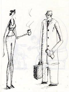
Conchita and I have one whom's package says in German:
stabmixer and in English: handblender.
I think both are quite funny.


Monday, October 19, 2009

This title unimaginatively refers to both recent life and old work.

Hopefuls,

I should be terribly sorry,
yet somehow I'm not.
The sweetest girl in the world is in Tanzania right now,
so I've been keeping myself busy lately as to not be reminded.
“Reminded of what?” you might ask —and rightfully so—
and on this very topic —an emotionally strong one at that—
I will enlighten you this awfully late blog.

Today's topic is loneliness. Yes.
Cooking for myself is a far cry from cooking for her
and our bed has morphed into a boring place.
Now, I'm not sure about the morphing part,
nonetheless: it's become a boring place.
As has our home.

Luckily work provides some distraction,
of which I got plenty, yet is as you might imagine:
Just. Not. The same.

It's fun as well, the work.
But I cannot provide you with any recent developments.
At least, not yet.
But of course I've got this big, big pile of animations
from which I'd be delighted to pick you some goodies.

Now only to make this theme work...
So I mentioned
loneliness, animation has this romantic
image of the animator working day and night
(emphasis on the 'night'-part) on films in the attic.
But this one I made together with a classmate,
Marlyn Spaaij, who has no website whatsoever.
But we made this for a Dutch tv-show
touching the subject of melanism,
animating to a pre-existing soundtrack.

My contributions list as follows:

• Paper texture
• Bambi's birth (not the mother though)
• The jaguar (including texture - animated to follow it's stretch)
• The 2D animated 3D'ish building
• The butterfly
• The sound design


Monday, September 7, 2009

The catacombs.

Dearest of hopefuls,

Making backups it struck me I could upload some
older stuff I animated in my first year as an animation student.
So I dug into the trusty dusty old external harddisk,
and found this little typographic animation I did.
We were assigned to make a purely typographical animation,
and have it promote the Holland Animation Film Festival.
So this was never actually used by the fine folks at HAFF,
but to me it was a great assignment nonetheless.

I mean: Typography AND animation! Instant happiness i'd say.

The music is 'Roses & Teeth for Ludwig Wittgenstein' by Matmos,
taken from their wonderfully exciting 2006 album
'The Rose Has Teeth in the Mouth of a Beast'.
I edited it down to a more applicable size.
Remember kids, this was in my first year as an animator,
so the video might not be as exciting as the audio.


Saturday, August 29, 2009

The Chase.

For a school assignment I was free to pursue any goal
and make whatever I felt important to add to my portfolio.
As long as it was animation.

So I thought of an animation with a character being chased
by the camera and thus the viewer.

The first fourteen-or-so seconds are okay I guess,
but after that I just wanted to finish it,
or rather my teacher wanted it finished.
I rushed and it's obvious I did.

I'm sorry dear hopefuls, I'm sorry to disappoint.
I know how you feel, I really do:
clicking your way through all these 0's & 1's...
And for what? For this shitstain-wallpaper?
Is this for real? Is it all just one big joke?

No, I know what it is:
It's just a miserable waste of potential,
a shattered dream, a big, bad, bullshit bag of
nothing but nothingness itself.

But what did you expect?
I'm a mere spoof in a half-recycled world
that is both creator and consumer of nothing.
Of course I'm joking, but I'm not.
There's quite some superficial obviousness in there,
but some more or less interesting ideas as well.
We could actually talk about it sometime,
over a glass of wine and on a night of long lasting.


Sketchbook Pt. VI, arguably VII.

Dear hopefuls,

Today seems to be good enough a day to share some
more of my sketches in the old sketchbook.
So please do sit back relaxed,
or on the edge of your seat for that matter.
Or just don't, I mean, I don't want to be oppressive,
you can do as you please, for it's the internet!
You have absolute free will and as for me:
who might I be to tell you to do anything
anyway?!
Can you believe it?
The nerve...


Doesn't he just look like
some sex offender?


This one —I figure—
speaks very much
for itself.

Don't you agree?

No, it's just a stream
of consciousness,
happy go lucky
sketching as I go along.


This one reads:
”DIRIGENTJE VENTJE”,
roughly meaning:
'conductor lad'.
Though more cute.


Aren't they
adorable?


Menthol Belinda's,
seriously: just Google
if you don't know.

Monday, August 17, 2009

Sketchbook Pt. V (or VI, if you will).

If things go as planned, internet and me will be reunited once more.
Until then I'll keep it as brief as I can be.

“I mean.”


“Yes.”

Thursday, August 13, 2009

Moving On.

It's been a long time since my last post, and I'm not going to apologize for it. Now if you insist on receiving an apology you could of course drop me a line. Not that it'll make much of a difference, but at least it generates interactivity. The last couple of weeks I spent my time moving to another house and now I'm waiting for Internet to be installed. Which apparently takes the pre-B.C. period of 4 to 5 weeks. Paying this small visit to the web I'd like to add some more sketches. Personally I like the last one best... This scene I imagine to be colored softly and somewhat de-saturated. It's all extreme slo-mo and we hear some melancholy piano tranquillity. No foley. Stay hopeful.


Saturday, July 11, 2009

The Big Make-Over.

Dear hopefuls,

This time I'd better come through with the good stuff,
as promised before. And you know what? I just might.

This animation is painted on paper and made for a school assignment
called the Remake, which was exactly that, expecting us
—hungry students— to remake (and —no pun intended— reanimate)
the work of an artist who's work we admired.

My pick was Georg Baselitz, for more reasons than I am willing to type
about right now. Since my work tends to be quite fragile I'm always
looking for ways to be more bold in my expressions and Baselitz
seemed to me the appropriate vehicle to get there.
Apart from that I'm always looking for ways to make my characters
more stylized, without them becoming too cartoonish or childish.
In my opinion Baselitz is really great at this.

Naturally I couldn't leave it at that, so I added several other studies:

To not scale anything digitally, but just draw and paint it smaller if
needed. Personally, I hate outlines that become thicker or thinner when
anything animated moves closer or further away respectively.

To animate a transition from one scene to another and make it a part
of the narrative (instead of just using a standard cut/wipe/dissolve).
When I scanned the animation and put it on a timeline it turned out
the narrative part didn't work out as well as I had meant it to be:
I had two scenes, one indoors with a man in the foreground and a
jacket in the background which the man puts on. Plus one outdoors
at night with a house set against a minimal background.

A door opens, lighting the landscape, but the door is on the side of
the house we don't see, leaving us to just see the light coming out of it.
But since the painted animation makes for such a strong moving hold,
one doesn't notice this light at all and what we see is a man putting on
a jacket whilst morphing to another image.

It's sad, isn't it? But at least we can learn something from these terrible
flaws, don't we, hopefuls?
Enjoy. And laugh at me laying bare my pity attempts at making
something that legitimizes my existence.
But know that while you're laughing, I'm learning,
and one day all these lessons will fall into place.
Then I might make something you want to see, but I won't let you,
because you laughed. Sweet revenge.


Monday, July 6, 2009

Walkcycle!

Okay, so this is fairly old.
It's done on paper (!), which I like, and again this could have been
better, but there was just not enough room for improvement.
Lame excuse, I know, but next time I'll remember these flaws and
do it better. I promise.

I should make more walkcycles I guess, it's good practice.

My notes on this one:

• The head needs some more attention, period;
• The upper half of his torso needs some more anticipation;
• His hands need to turn more;
• His right arm has one frame of inconsistent length, making it morph.

Apart from it being on paper, it's on triples as well,
whereas I mostly animate on doubles, thus revealing the economic me.

That's it for now, next post I'll add my painted animation.


Sunday, July 5, 2009

Sour Milk.

Now I can't go to bed and not upload my animation of the cat I mentioned in my previous post. The assignment was to find or make a 10 second audio fragment to animate upon. I chose a piece of dialogue from Lock, Stock and animated these bad-ass wiseguy cats. It's lipsync was the main goal, but my personal agenda was especially drawn to the possibilities 2D offers that 3D can't and the problems that present themselves animating these lines that do not bow before realism.